MS Grants
A web portal moving $100M+ in research grants a year, built as a near-literal copy of the paper process it replaced: brittle, structureless, and fighting its users. As design lead, I rebuilt it around how administrators actually think.
Role
Design Lead
Scope
Full UX transformation
Funding managed
$100M+ in grants, yearly
Impact
Zero data loss, dozens of hours saved weekly
The Problem
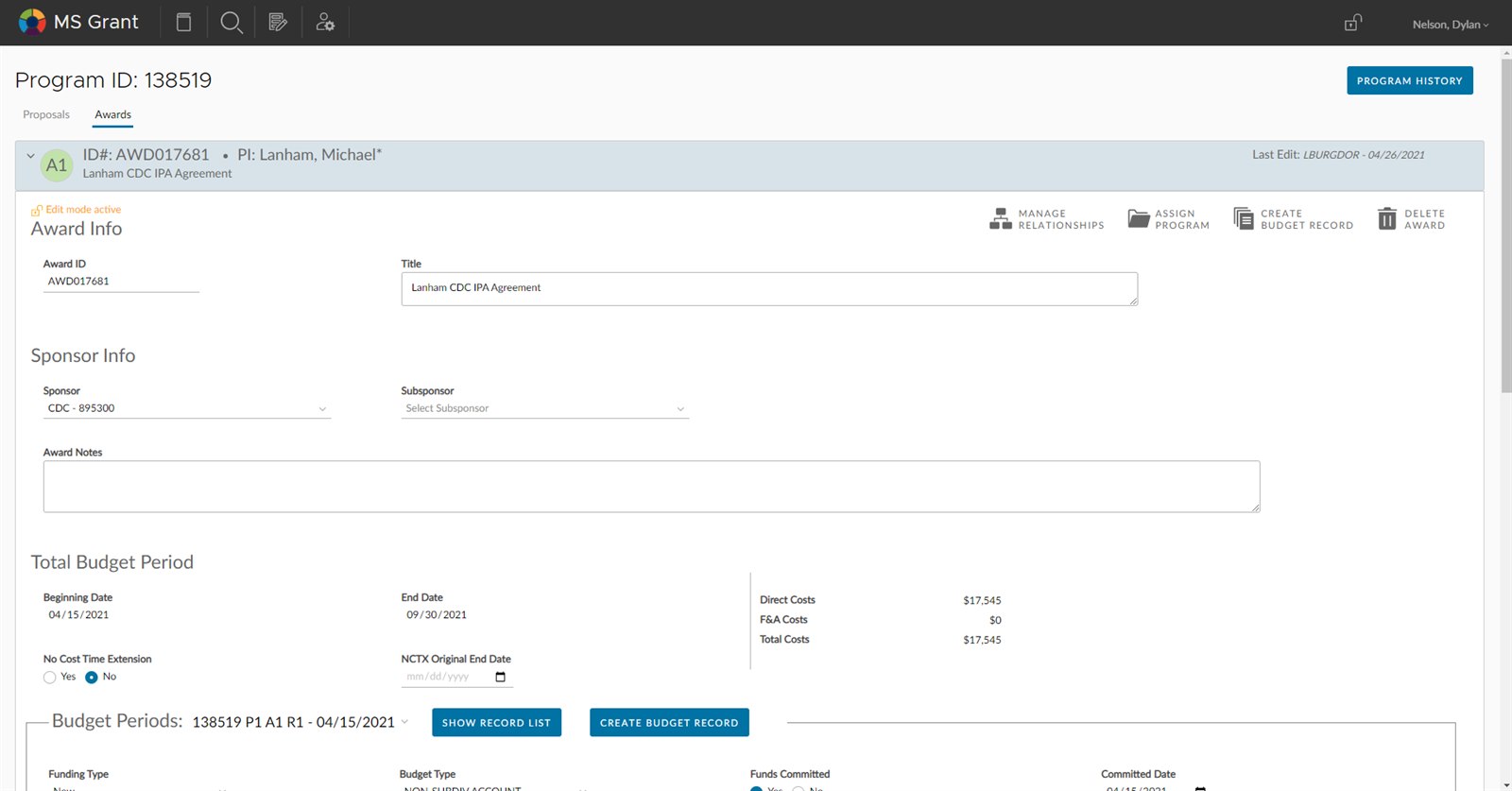
The portal had been built as a literal representation of the division's paper process, as if each form had been scanned and turned into its own page. There was no underlying object model and no central navigation, just a web of highly customized, non-standard links strung from one form to the next. The flows were brittle, and obvious chances to improve them had been passed over in favor of matching the paperwork exactly.
The brittleness surfaced everywhere, but the sharpest example was the browser's back button: pressing it (the most natural interaction in web browsing) crashed the app and wiped unsaved data. A workaround culture had grown up around it:
- Staff copied form data into Word documents as backup before submitting.
- New employees were warned about the back button during training, a sign the tool was built against its users.
- Multi-step grant submissions were dreaded, because a single misstep could wipe hours of progress.
Underneath the bugs was a structural mismatch: the system was organized around forms and database tables, while the people using it thought in terms of grants, investigators, budgets, and deadlines, the real objects of their work.
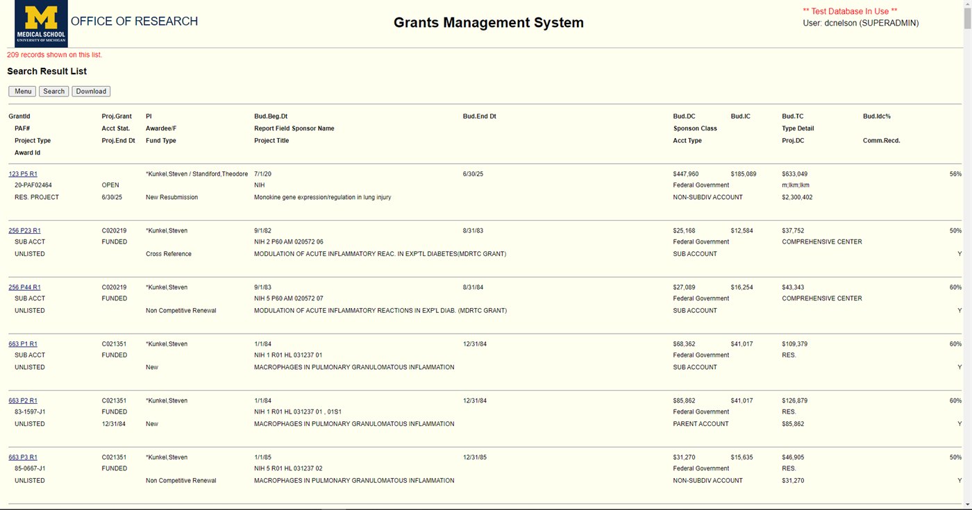
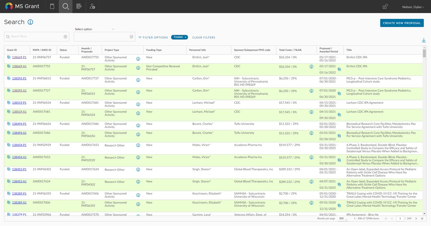
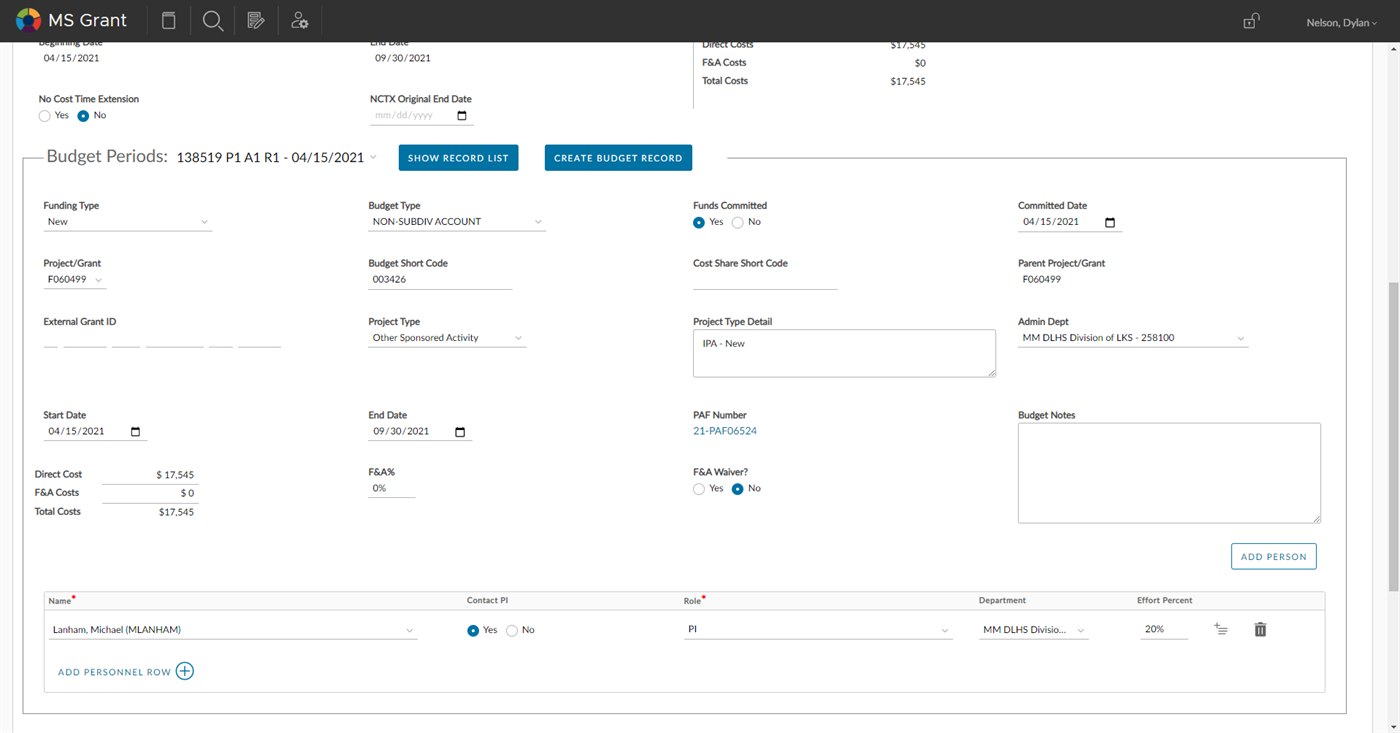
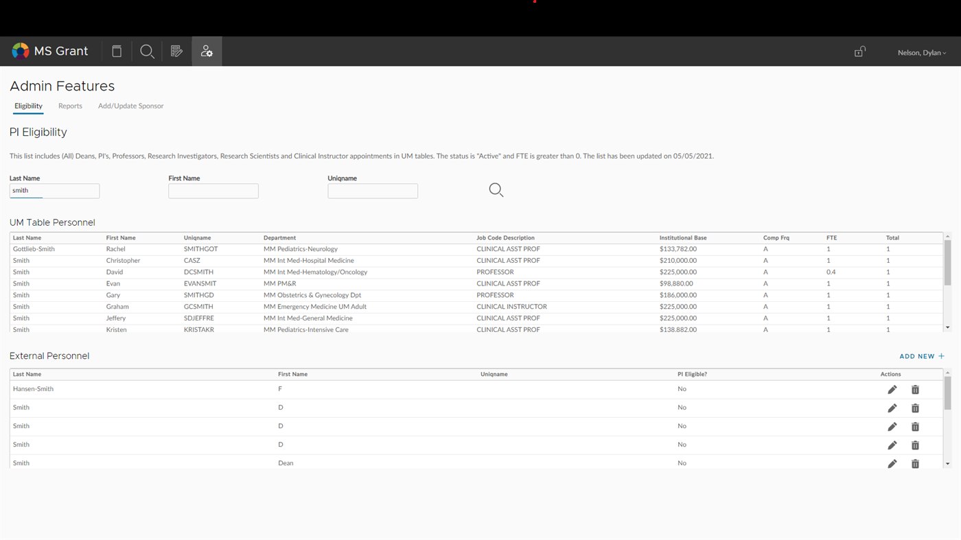
The same task, before and after: find the grant you need. The original returned a flat list of every matching record with no way to narrow it and no visual hierarchy to scan: the paper report, transcribed to a screen. The rebuild made the objects and their status legible, and gave administrators the filters to get to a single grant instead of reading for it.
The Approach
Object-Oriented UX
Rather than redesigning screens, I restructured the entire application around the real-world objects that administrators work with daily. Using an Object-Oriented UX (OOUX) framework, I mapped out the core objects (grants, investigators, budgets, reports, deadlines) and the relationships between them.
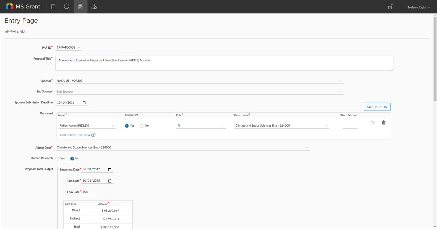
This went beyond IA. It fundamentally changed how pages were structured. Instead of navigating through process-oriented flows ("Step 1: Enter investigator details, Step 2: Enter budget..."), administrators could navigate to a grant object and see everything related to it: who's on it, what the budget looks like, what's due, what's been submitted. The object became the organizing principle, not the process.
Eliminating the crash
The back-button crash was a technical problem, but the solution was a design decision. I introduced two mechanisms:
- Auto-save. The application continuously saved work in progress. No more "submit or lose everything." If the browser crashed, the tab closed, or yes (someone hit the back button), their data was preserved.
- Custom internal navigation. I designed a navigation system within the application that replaced the need for browser navigation entirely. A persistent sidebar and breadcrumb system gave users clear, safe pathways through the application. A custom back button within the UI did what the browser back button should have done: navigate without destroying state.
Results
The auto-save and internal navigation changes completely eliminated data loss. The back-button crash, which had defined the product's reputation for years, stopped being a problem.
The OOUX restructuring had a compounding effect. Administrative tasks that previously required navigating through multiple process flows could now be completed from a single object view. The reduction in steps, combined with the elimination of defensive workarounds (copying to Word, manual saves), freed up dozens of hours per week across the team.
The change also reshaped onboarding. New administrators no longer needed to be warned about dangerous interactions or memorize process sequences. The object-oriented structure matched how they already thought about grants. Training time dropped significantly because the interface stopped fighting its users.
Design principles
Fix the floor before raising the ceiling. The back-button crash was unglamorous work, not the kind of redesign that lands in a pitch deck. But eliminating it changed the entire relationship users had with the tool. Good UX can't layer on top of broken trust.
Structure beats features. The OOUX restructuring added no new capabilities. Every feature already existed. Reorganizing around the user's mental model (grants as objects, not processes as sequences) made the whole system feel simpler without removing anything.
Prioritize by leverage, not polish. On a $100M+ system, scope discipline mattered more than coverage. The wins came from the highest-leverage changes, the ones that cascaded through the entire experience, not from polishing every screen.