Hub Pro
Hub Pro is Catapult's ground-up re-platform of Thunder: the tool professional teams have run their week on for years. As lead designer across nearly the whole product, I owned the hardest constraint of any re-platform: modernize a tool coaches depend on without making them relearn their job.
Role
Product Designer
Scope
15+ feature areas across the platform
Approach
Designs & prototypes in the React/TypeScript codebase
Impact
$10M+ revenue & dozens of NFL/NCAA contracts defended
At a glance
Rebuild a tool professional coaching staffs depend on, without making them relearn their job.
- Autosave replaced manual saving, and “lost work” support tickets went to zero.
- The data table was rebuilt on spreadsheet conventions coaches already knew, so entering data stopped fighting film review.
- Tagging sorts a game’s clips into every reel a staff needs, in a pass through footage they were already watching, and title slides frame each segment for the room.
- A semantic token architecture and a WCAG 2.2 AA pass made fifteen-plus feature areas read as one tool.
If you only read one section: the data table rebuild →
The Problem
Coaches don't casually switch software. The teams Catapult works with had spent years building their week around Thunder, Catapult's legacy analysis tool. Every film session and strategy meeting ran through it, and the workflow lived in their muscle memory. It worked, and teams paid well for it.
But Thunder was showing its age. Built on dated technical conventions, it was brittle, slow, Windows-only, and hard to innovate on. To hold onto those teams, and win new ones on the promise of modern technology, Catapult needed to re-platform it from the ground up. The hard part was never the feature list. It was this:
Rebuild a tool people depend on, without making them relearn their job. Change too much and you trigger the change aversion that makes a coaching staff abandon a product mid-season and take their contract with them. Change too little and there's no reason for a new team to switch at all. My job as lead designer was to hold that line: keep the experience familiar enough that no coach loses a step, and spend the design budget on the workflow improvements impactful enough to justify the move.
That constraint is also why I work in the codebase myself, not just in design tools. Building in the real product context reproduces the critical workflows coaches depend on with maximum accuracy, and gives every deviation from precedent room to be tested in place before it ships, so nothing they rely on is lost in the handoff.
The Platform
Hub Pro is where coaching staff review film, break down performance data, and build what they present to players, running on the web and as a desktop app from one codebase.
I led design across most of the product. A quick map of the surface area:
- Media player & presentation: presenting mixed media (video, slides, PDFs, images) and multi-angle playback to a room or an external display
- Data tables: spreadsheet-style navigation, multi-cell copy/paste, flagging, and inline editing
- Canvas authoring: one artboard-style editor covering both title slides and on-video overlays that fill in with real per-clip data
- Pivot tables & charting: drag-and-drop analytics with filtering that flows across table, pivot, and chart
- UI & information architecture: restructured navigation and layout into a floating-panel workspace, plus a full visual modernization
- Design system: component library, design-token architecture, and dark/light theming
- Tag & Distribute: keyboard-driven tagging and batch distribution of clips
- iPad touch controls: radial joystick and tool clusters for coaching on a touchscreen
- …and dozens more: the smaller touchpoints, interactions, and refinements that never earn their own case study but add up to how the product feels day to day
The list is broad, but range was never the point on its own. I led the design across these areas and stayed close to the craft of each, measuring every decision against how coaches actually move through their week, so the platform feels like one coherent tool rather than fragmenting into features built in isolation.
Understanding Coaches
A coaching staff's week runs on a clock. Between games, they have only days (travel included) to scout the next opponent, break down hours of film alongside performance data, shape it into a game plan, and install that plan with players before kickoff. Miss the window and the work is stale.
The whole week is a countdown between games. Games land Thursday through Monday, and a standard week builds toward a Saturday kickoff.
- Game day · Thu–Mon Kickoff The result is in, and the countdown to the next opponent starts the second the game ends.
- Sun Scouting starts immediately Opponent scout and self-scout kick off right after the game. Only a couple of days to work with, travel included.
- Mon Build the game plan Coaches meet to turn the scouting into a plan for the week.
- Tue Walk-through Players get their first look at the plan, at walk-through speed.
- Wed Installation in full swing First full practice. The game plan has to be installed and getting repped by now.
- Thu–Fri Refine, and keep reviewing The team covers the plan right up to the night before, while film review keeps surfacing new wrinkles.
- Game day Next kickoff The plan meets the opponent, and the entire week resets.
That's the week Hub Pro has to fit into, without ever slowing it down.
Hub Pro is where most of that happens: pulling and organizing clips, tagging what matters, cross-referencing the data, and building the breakdowns coaches walk their team through. It isn't a tool they open occasionally; it's the workbench for the highest-pressure hours of their week.
That pressure is exactly what made the re-platform so delicate. When a tool is load-bearing for your job and you're racing a weekly deadline, you have no patience for relearning it. Every familiar step Hub Pro preserved was time coaches kept, and every workflow it improved had to earn its place without ever slowing them down.
Rebuilding the Foundation
Some improvements are worth changing a habit for. Saving was one of them, and it became one of the re-platform's strategic pillars.
From manual save to autosave
Thunder put saving in the coach's hands: remember to save, or risk losing the session. Coaches had built defensive habits around that: constant manual saves, duplicate files, a steady low hum of anxiety about losing work. The re-platform was the chance to take that burden off them entirely, and I led the transition to an autosave model, where every action a coach makes is captured the moment they make it.
But removing a control people are used to is exactly the kind of change that can breed distrust. If coaches don't believe autosave works, they'll keep saving manually anyway, and the improvement is worthless. So the design problem wasn't "save automatically." It was making the system feel dependable: work saved instantly on-device and synced in the background, with clear, honest status so coaches can always see the state of their files. No silent failures, no guessing.
The result: coaches stopped working defensively, and "lost work" support tickets went to zero, the trust foundation the rest of the re-platform could stand on.
Data Table Rebuild
The data table is where coaches spend most of their time: reviewing clip metadata, editing labels, and flagging moments. It’s also the playlist: the same grid that queues video is where the data gets entered. So when its interaction model was broken, it broke the core loop of the tool.
When I picked it up, cells had no focus state, and leaving an edit auto-advanced straight into the next cell’s edit mode, which hijacked video playback and locked up the keyboard shortcuts coaches rely on to control the footage. Entering data fought against watching the film, and coaches do both at once.
The tempting move was to invent something smarter. The right one was the opposite: match the spreadsheet conventions coaches already had in muscle memory. Single-click to focus a cell, double-click to edit, Tab and Enter to move between them, and the arrow keys left dedicated to the video, so entering data never interrupts the film. No relearning; the grid just behaved the way coaches already expected it to.
Around that I added the depth the work needed without adding friction: multi-cell copy and paste that skips read-only cells and reports back what it applied, and number-key flagging to tag moments without ever leaving the footage.
The result: the spreadsheet-level speed coaches expect from a professional tool, without the workflow-breaking friction the rebuild had inherited. And because I built the interaction in the codebase instead of writing a spec for it, engineering inherited working code and it landed exactly as intended. More on how I work in code →
Tag & Distribute
The moment a game ends, a coach has hundreds of new clips and about two days to turn them into everything the week needs: the defensive line’s reel, the quarterback’s, third-down situations, the cut-ups that drive each position meeting. Every one of those is the same footage sorted a different way.
Sorting it was manual: work through the clips, move them one at a time into the right playlists, then start over for the next group. It landed at the worst point in the week, right at the front edge of the scouting window when the clock is tightest.
The problem underneath was that sorting and watching had been made into two separate jobs. Coaches were already deciding which reel a clip belonged in while they watched it. The judgment was free, and only the filing was expensive. So tagging should ride along with review instead of following it.
Coaches set up two to sixteen color-coded columns, then tag with the number keys as clips play. Arrow keys move between rows. The columns append onto the data table they’re already working in, so nothing new has to be learned and nothing takes their hands off the footage. Presets let a staff save the column setup they use every week.
Distribution is a two-panel step: tagged columns on the left with their clip counts and destinations, the app’s own folder tree on the right, the same tree from everywhere else in the product, not a new navigation model invented for this modal. Only columns with an assigned destination go, and the session stays open afterward, so clips move in waves as the picture firms up rather than in one all-or-nothing commit.
The result: a tedious manual sort became a pass through footage coaches were going to watch anyway.
Canvas Authoring
A film session is a sequence of segments: third downs, red zone, the opponent’s base defense, one position group at a time. On screen it’s just clips. One cut-up runs into the next, and the structure of the session exists only in the head of the coach presenting it, while the room works out which segment they’re in and why they’re watching this.
There’s a second, related gap: the data a coach holds on every clip (the down, the distance, the player being coached) lives in the table, not on the screen when the room is watching. One problem wants a slide between clips. The other wants a graphic on top of one. Both are a coach composing against a video canvas, so I designed and built one editor to do both.
It’s a 1920×1080 canvas that scales to whatever it’s shown on, composed the way a coach would compose anything else: images, shapes, and text, with alignment, positioning, layering, grouping, snap-to-grid, direct manipulation, and undo that behaves the way it does everywhere else in the product. It does what a design artboard does, not what a label maker does. A fill-in-the-blank builder only produces the graphics someone thought to anticipate, and what a staff needs to say changes week to week.
As title slides, the output is an image artifact that sits in the playlist as an item in its own right. One closes out a set of clips, the next introduces the one coming up, so each segment announces itself instead of the coach having to. Slides save as reusable templates, so a staff sets its look once.
As overlays, the same composition sits over the play itself, and text can be bound to a data column instead of typed. On the canvas it reads as a placeholder: [Player Name], [Down & Distance]. During playback it resolves to the real value for the clip on screen. One template labels an entire playlist correctly without being touched again.
The result: the structure of a film session became something the room can see, and the data behind a clip became something it can read, from one authoring system rather than two. Title slides became one of the features that drove adoption of Hub Pro.
In the room
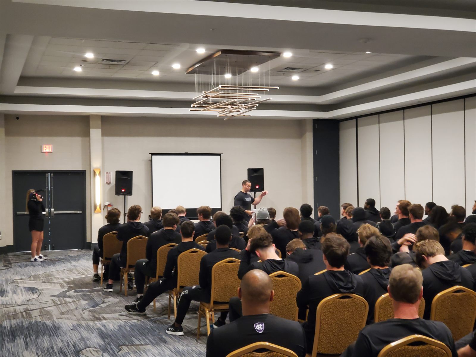
Tagging and title slides are both upstream work, and their whole purpose is a room the designer usually never sees. A squad meeting: one display at the front, a coach walking a team through what happened and what’s coming. The reel is what Tag & Distribute produced. The frame around each segment is the title-slide system. By the time any of it matters, the design is invisible: it’s a coach, a screen, and a room of players.
I’ve sat in that room. I spent a season embedded with Holy Cross football, running the live-clipping station on game day and sitting in on team meetings through the week.
That season isn’t where these two features came from, but it’s where I could see what they’re for. Watching from the back of a meeting is the difference between knowing a playlist gets presented and knowing what it costs when the structure of that session lives only in one person’s head. The full story of that season →
Results
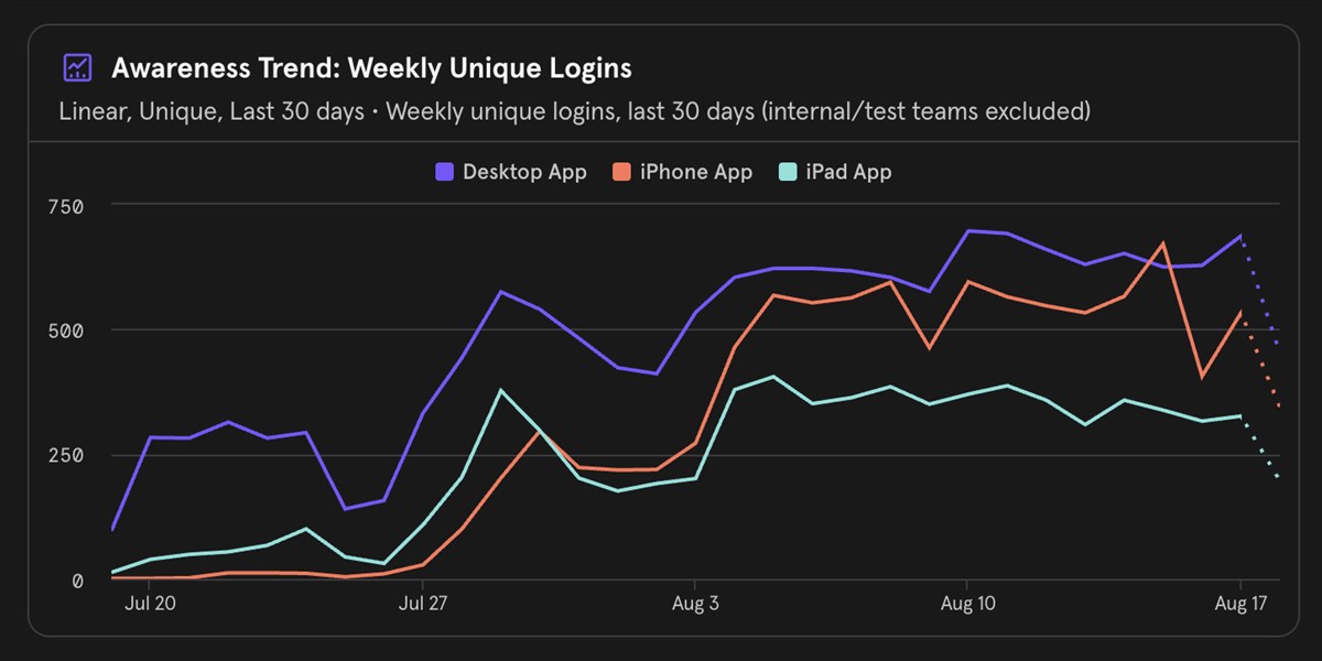
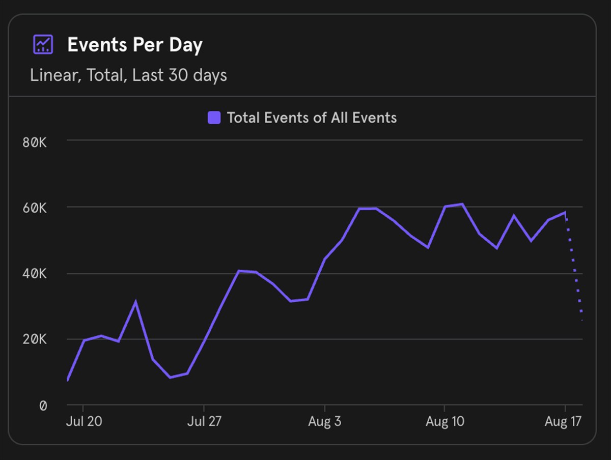
The stability overhaul eliminated the trust deficit that had been undermining the entire product. Coaches stopped working defensively and started using the full feature set again.
The iPad touch controls freed film review from the desk, so the travel that eats into a tight scouting week becomes working time, and coaches can do real analysis on a plane or a bus without dropping to a stripped-down mobile experience. And the data table rebuild gave coaches the spreadsheet-level efficiency they expect from a professional analysis tool.
Tagging and title slides compressed the other end of the week: the stretch between watching film and standing in front of a team. Sorting a game’s clips into every reel a staff needs became a pass through footage they were watching anyway, and the meetings that footage feeds now arrive already structured.
Design principles
Trust is the prerequisite. No amount of workflow improvement matters if users don't trust the tool to keep their work safe. Fixing the unglamorous infrastructure problem unlocked everything that followed.
Know when not to redesign. On a re-platform, the instinct to improve everything is exactly what loses customers. The most valuable moves were the restrained ones: preserving the muscle memory coaches already had, so the changes that mattered had room to land.
Designing and building aren't separate skills. Working in the codebase surfaces the states, edge cases, and interaction timings a static spec can't capture, shrinking the gap between design intent and what ships to near zero.
Make it feel physical. The iPad joystick works because it borrows from game controllers, not UI patterns. The best interactions have weight and resistance. They don't feel like clicking buttons on a screen.