Immortal Conquest
NetEase's Western release of a hit Chinese strategy game was underperforming the original. Brought in from the target market to review it, I found the culprit: a bold character identity that never reached the UI, where, in a strategy game, players spend all their time.
Role
UX Design Intern
Company
NetEase Games
Focus
Visual identity & UI/UX overhaul
Recognition
Designer of the Month, revenue impact
The problem
NetEase had built a Western release of a hit Chinese mobile strategy game, Immortal Conquest, but the port was lagging the original on engagement and revenue. To close the gap with players in a new market, they brought in a designer from that market. There was no formal brief; I was asked to review the game and find what was holding it back.
The clearest problem was the visual identity. The characters had a bold, distinctive look that had never carried into the interface, which had been built quickly and generically. In a strategy game, the UI is the experience: players live in menus, shops, and management screens far more than in any cutscene, and a flat, generic interface was quietly undercutting the whole game.
So the work set itself: carry the game's identity into its interface to attract new players and re-engage existing ones. I started with the economy (the shop, market, taxes, and trade), the screens where engagement turns into revenue.
The gem shop
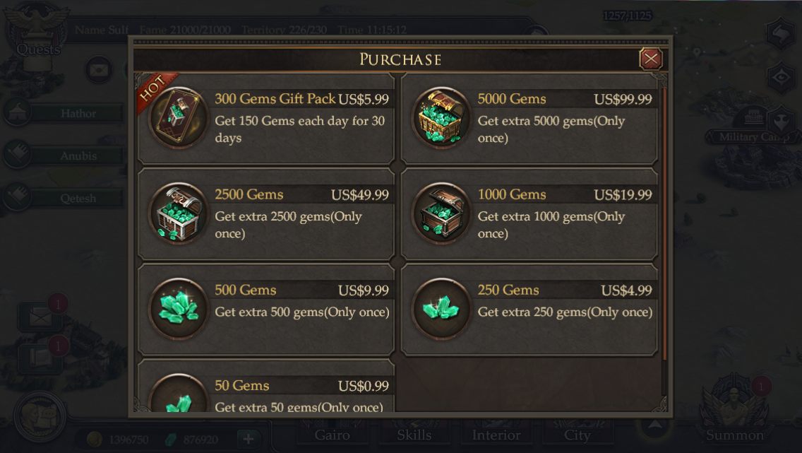
A game built to get people spending shouldn't greet them with a spreadsheet, but the original shop did exactly that: a plain list of gem tiers and prices, with no character and no sense of occasion. For a store meant to drive revenue, that flat, transactional feel left value on the table. With latitude to overhaul the game's UX, it was one of the first places I focused.
What I changed
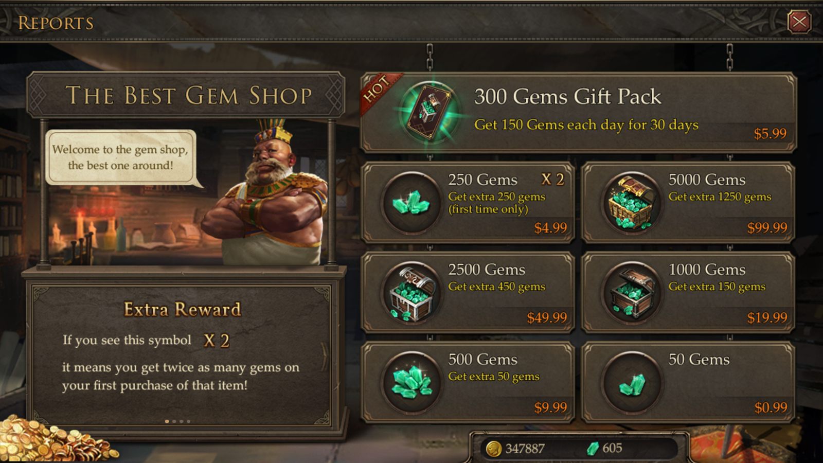
The redesign led with personality. I introduced a shopkeeper to lighten the mood around spending (rotating speech bubbles and a bit of humor), so the store felt like a character, not a checkout. I reorganized the offerings so the whole shop fit on screen without scrolling, pulled the best deals up front where players would actually see them, and used the storefront space to explain deals, perks, and rotating shop events. Same purpose as the original, but a place players now enjoyed visiting.
Redesigning the economy
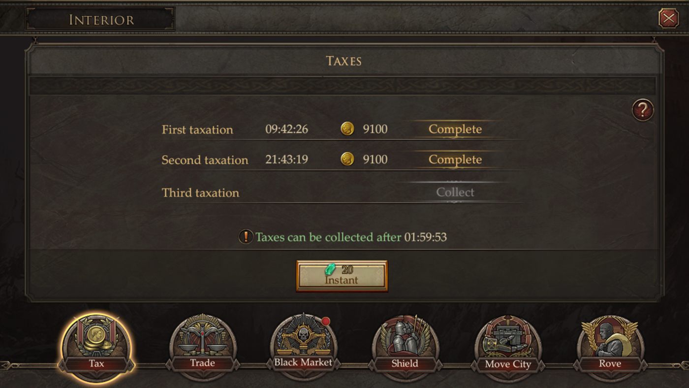
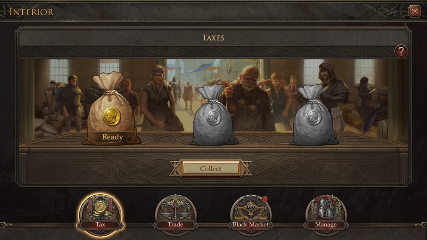
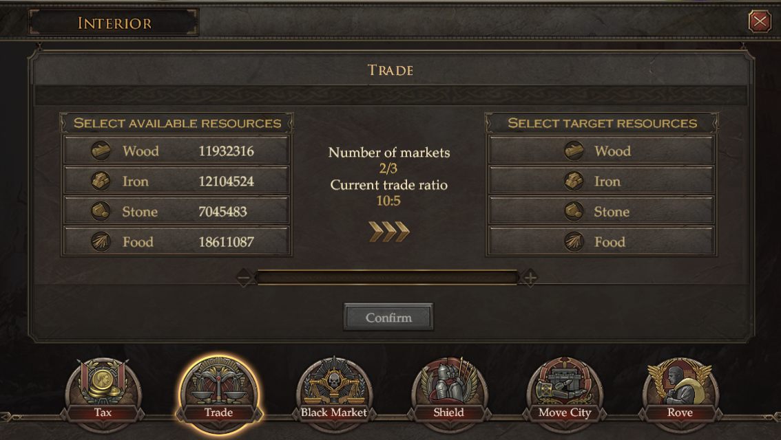
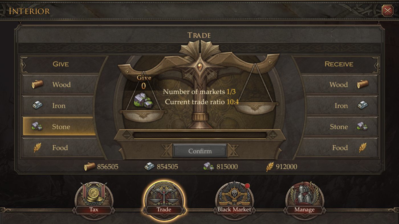
Beyond the store, I reworked the everyday economy screens players use to keep their empire running. The originals were functional but read like forms: lists of timers and fields that told you nothing about what you were doing. I rebuilt them to show the action, not just the data.
Taxes went from a stack of labeled timers to a scene: collectors, coin bags, a single clear "collect." Trade went from two resource lists to a balance-scale give-and-receive that makes the exchange feel physical. Same functions, but now they look like part of the game.
Across the store and the map
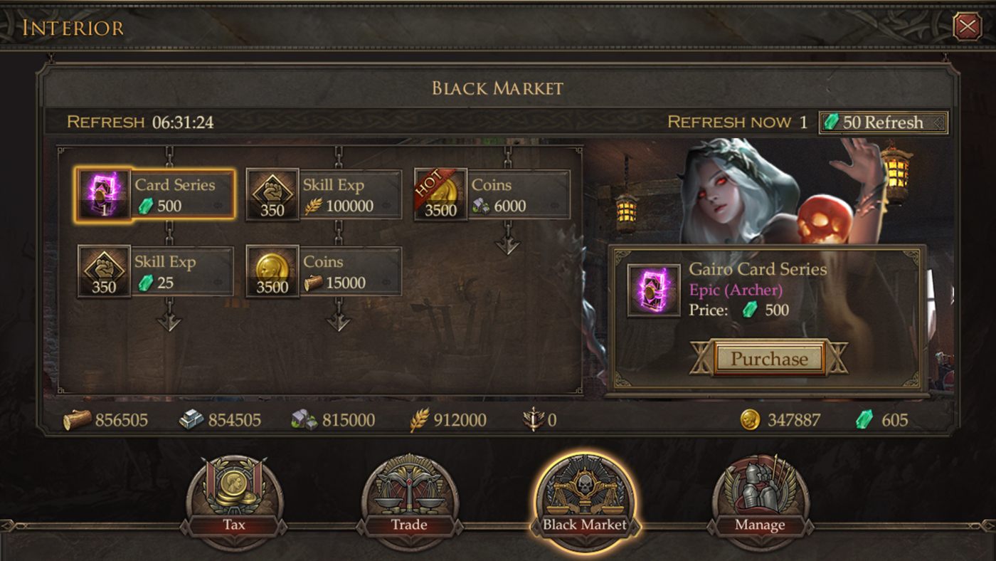
The internship spanned more than a single feature. I designed and shipped screens across the game's spending and management surfaces: the black market and its collectible cards, resource and territory management, player stats, all held to the same bar: clear first, on-theme always.
What came of it
The screens shipped into the live game, and the monetization work did its job: I was named Designer of the Month for the contribution my designs made to the game's revenue: recognition, as an intern, that the work moved the number that mattered to the business.